Extracting a Reference Grid of your Data for Machine Learning Models Visualization
Sometimes, for visualization purposes, we want to extract a reference grid of our dataset. This reference grid often contains equally spaced values of a “target” variable, and all other variables “fixed” by their mean, median or reference level. The refdata of the psycho package was built to do just that.
The Model
Let’s build a complex machine learning model (a neural network) predicting the Sex (the probability of being a man, as women are here the reference level) of our participants with all the variables of the dataframe.
# devtools::install_github("neuropsychology/psycho.R")  # Install the latest psycho version if needed

# Load packages
library(tidyverse)
library(caret)
library(psycho)

# Import data
df <- psycho::affective %>%
  standardize() %>%  # Standardize
  na.omit(df)  # Remove missing values

# Fit the model
model <- caret::train(Sex ~ .,
                      data=df,
                      method = "nnet")
varImp(model, scale = TRUE)
## nnet variable importance
##
##                    Overall
## Salary2000+        100.000
## Concealing          48.761
## Adjusting           46.198
## Birth_SeasonSpring  39.289
## Life_Satisfaction   22.567
## Salary<2000          9.176
## Birth_SeasonSummer   8.863
## Birth_SeasonWinter   6.624
## Tolerating           5.686
## Age                  0.000
It seems that the upper salary category (> 2000€ / month) is the most important variable of the model, followed by the concealing and adjusting personality traits. Interesting, but what does it say about the actual relationship between those variables and our outcome?
Simple
To visualize the effect of Salary, we can extract a reference data with all the salary levels and all other variables fixed at their mean level.
newdata <- df %>%
  select(-Sex) %>%  # We remove the  sex as it is our variable "to predict"
  refdata("Salary")
newdata
knitr::kable(newdata, digits=2)
| Salary | Age | Birth_Season | Life_Satisfaction | Concealing | Adjusting | Tolerating |
|---|---|---|---|---|---|---|
| <1000 | 0.11 | Fall | -0.01 | 0 | 0.03 | -0.02 |
| <2000 | 0.11 | Fall | -0.01 | 0 | 0.03 | -0.02 |
| 2000+ | 0.11 | Fall | -0.01 | 0 | 0.03 | -0.02 |
We can make predictions from the model on this minimal dataset and visualize it.
predicted <- predict(model, newdata, type = "prob")
newdata <- cbind(newdata, predicted)

newdata %>%
  ggplot(aes(x=Salary, y=M, group=1)) +
  geom_line() +
  theme_classic() +
  ylab("Probability of being a man")

Well, it seems that males are more represented in categories with lower and uppper salary classes (that least, that’s what the model learnt).
Multiple Targets
How does this interact with the concealing personality trait?
newdata <- df %>%
  select(-Sex) %>%
  refdata(c("Salary", "Concealing"))  # We can sepcify multiple targets
newdata
knitr::kable(head(newdata, 5), digits=2)
| Salary | Concealing | Age | Birth_Season | Life_Satisfaction | Adjusting | Tolerating |
|---|---|---|---|---|---|---|
| <1000 | -2.52 | 0.11 | Fall | -0.01 | 0.03 | -0.02 |
| <2000 | -2.52 | 0.11 | Fall | -0.01 | 0.03 | -0.02 |
| 2000+ | -2.52 | 0.11 | Fall | -0.01 | 0.03 | -0.02 |
| <1000 | -1.99 | 0.11 | Fall | -0.01 | 0.03 | -0.02 |
| <2000 | -1.99 | 0.11 | Fall | -0.01 | 0.03 | -0.02 |
This created 10 evenly spread values of Concealing (from min to max) and “merged” them with all the levels of Salary.
predicted <- predict(model, newdata, type = "prob")
newdata <- cbind(newdata, predicted)

newdata %>%
  ggplot(aes(x=Concealing, y=M, colour=Salary)) +
  geom_line() +
  theme_classic() +
  ylab("Probability of being a man")
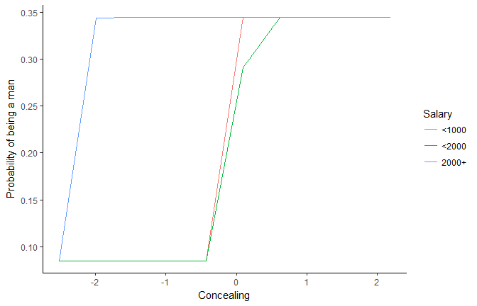
This plot is rather ugly…
Increase Length
newdata <- df %>%
  select(-Sex) %>%
  refdata(c("Salary", "Concealing"), length.out=500)  # Set the length by which to spread numeric targets

predicted <- predict(model, newdata, type = "prob")
newdata <- cbind(newdata, predicted)

newdata %>%
  ggplot(aes(x=Concealing, y=M, colour=Salary)) +
  geom_line(size=1) +
  theme_classic() +
  ylab("Probability of being a man")
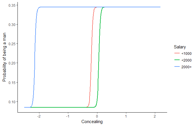
It seems that for richer people, the concealing treshold for increasing the probability of being a male is lower.
How to Fix (Maintain) Numeric Variables?
For now, all other variables were fixed to their mean level. But maybe their behaviour would be different when other variables are low or high.
newdata_min <- df %>%
  select(-Sex) %>%
  refdata(c("Salary", "Concealing"), length.out=500, numerics = "min") %>%  # Set the other numeric variables to their minimum
  mutate(Fixed = "Minimum")
newdata_max <- df %>%
  select(-Sex) %>%
  refdata(c("Salary", "Concealing"), length.out=500, numerics = "max")%>%  # Set the other numeric variables to their maximum
  mutate(Fixed = "Maximum")
newdata <- rbind(newdata_min, newdata_max)

predicted <- predict(model, newdata, type = "prob")
newdata <- cbind(newdata, predicted)

newdata %>%
  ggplot(aes(x=Concealing, y=M, colour=Salary)) +
  geom_line(size=1) +
  theme_classic() +
  ylab("Probability of being a man") +
  facet_wrap(~Fixed)
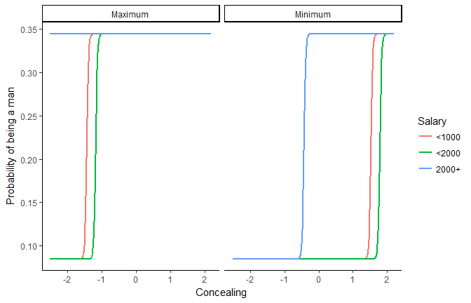
When all variables are high, concealing is not related to the sex for richer people. When the variables are set to their minimum, the concealing treshold for the two lower salary classes is higher (around 1.5).
Chains of refdata
Let’s say we want one target of length 500 and another to length 10 To do it, we can nicely chain refdata.
newdata <- df %>%
  select(-Sex) %>%
  refdata(c("Adjusting", "Concealing"), length.out=500) %>%
  refdata("Adjusting", length.out=10, numerics = "combination")

predicted <- predict(model, newdata, type = "prob")
newdata <- cbind(newdata, predicted)

newdata %>%
  mutate(Adjusting=as.factor(round(Adjusting, 2))) %>%
  ggplot(aes(x=Concealing, y=M, alpha=Adjusting)) +
  geom_line(size=1) +
  theme_classic() +
  ylab("Probability of being a man")
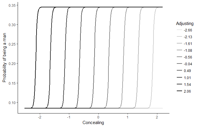
The concealing treshold highly depends on adjusting. The more adjusting is high (dark lines), the less concealing is needed to increase the probability of being a man.
Combinations of Observed Values
Let’s observe the link with Adjusting by generating a reference grid with all combinations of factors (salary, birth month etc.), and fixing numerics to their median (we could also chose “combinations” but it would generate a very, very very big dataframe with all possible combinations of values).
newdata <- df %>%
  select(-Sex) %>%
  refdata("Adjusting", length.out=10, factors = "combination", numerics = "median")

predicted <- predict(model, newdata, type = "prob")
newdata <- cbind(newdata, predicted)

newdata %>%
  ggplot(aes(x=Adjusting, y=M)) +
  geom_jitter(size=1, width=0, height = 0.01) +
  geom_smooth(size=1, se=FALSE) +
  theme_classic() +
  ylab("Probability of being a man")
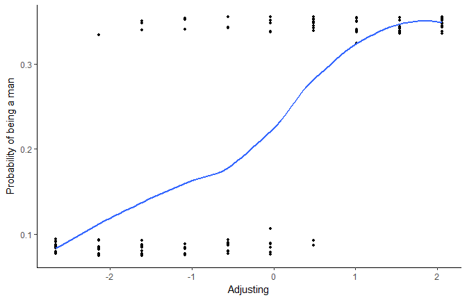
The more adjusting is high, the more probability there is to be a man. But let’s generate now much more observations.
newdata <- df %>%
  select(-Sex) %>%
  refdata("Adjusting", length.out=10000, factors = "combination", numerics = "median")

predicted <- predict(model, newdata, type = "prob")
newdata <- cbind(newdata, predicted)

newdata %>%
  ggplot(aes(x=Adjusting, y=M)) +
  geom_jitter(size=1, width=0, height = 0.01, alpha=0.2) +
  geom_smooth(size=1, se=FALSE) +
  theme_classic() +
  ylab("Probability of being a man")
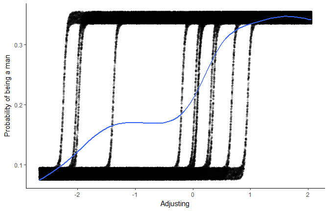
We can still see, “behind the scenes”, how different factors influence this relationship.
Credits
This package helped you? Don’t forget to cite the various packages you used :)
You can cite psycho as follows:
- Makowski, (2018). The psycho Package: An Efficient and Publishing-Oriented Workflow for Psychological Science. Journal of Open Source Software, 3(22), 470. https://doi.org/10.21105/joss.00470
Contribute
psycho is a young package and still need some love. Therefore, if you have any advices, opinions or such, we encourage you to either let us know by opening an issue, or even better, try to implement them yourself by contributing to the code.
Previous blogposts
- Copy/paste t-tests Directly to Manuscripts
- APA Formatted Bayesian Correlation
- Fancy Plot (with Posterior Samples) for Bayesian Regressions
- How Many Factors to Retain in Factor Analysis
- Beautiful and Powerful Correlation Tables
- Format and Interpret Linear Mixed Models
- How to do Repeated Measures ANOVAs
- Standardize (Z-score) a dataframe
- Compute Signal Detection Theory Indices